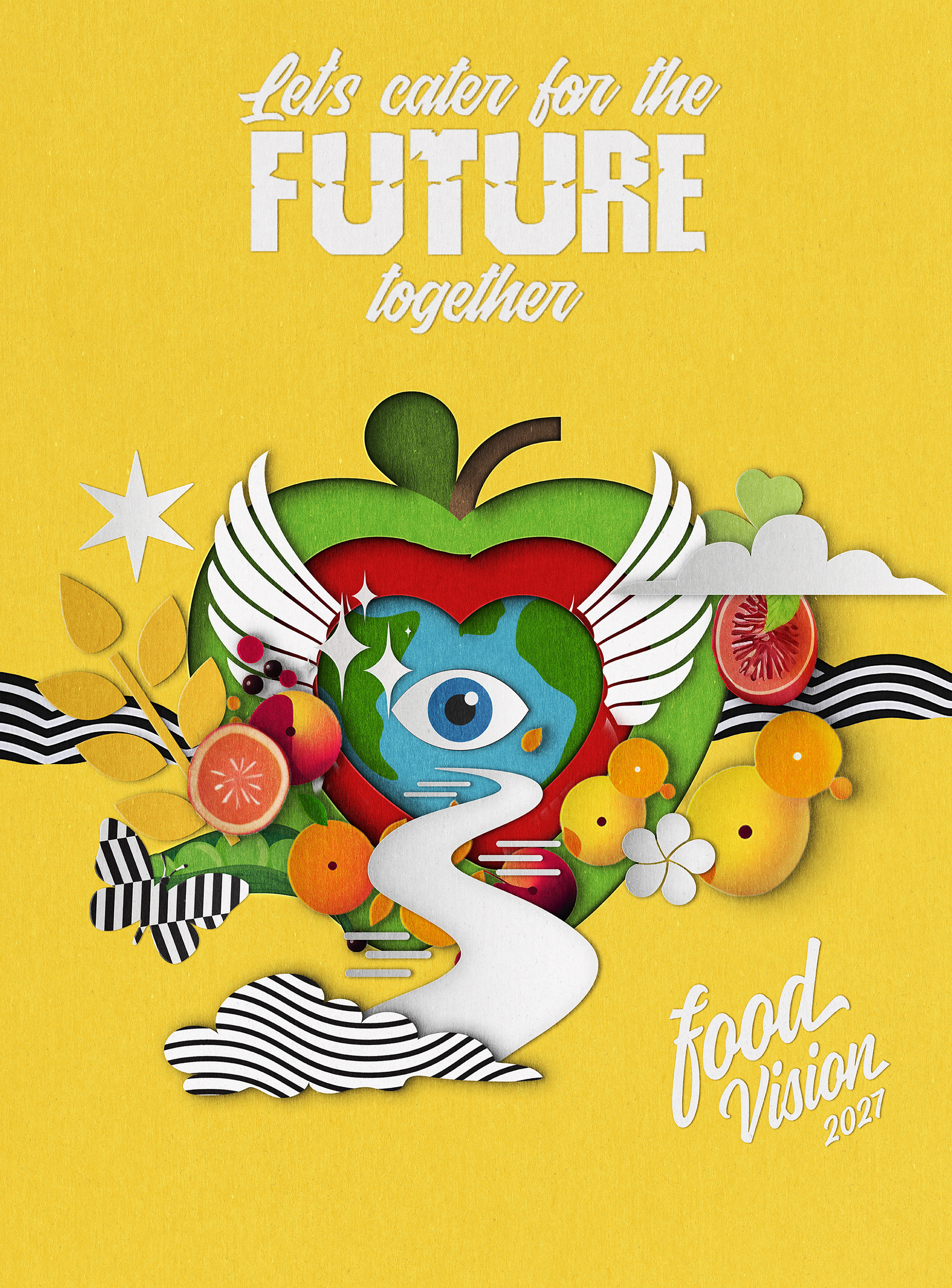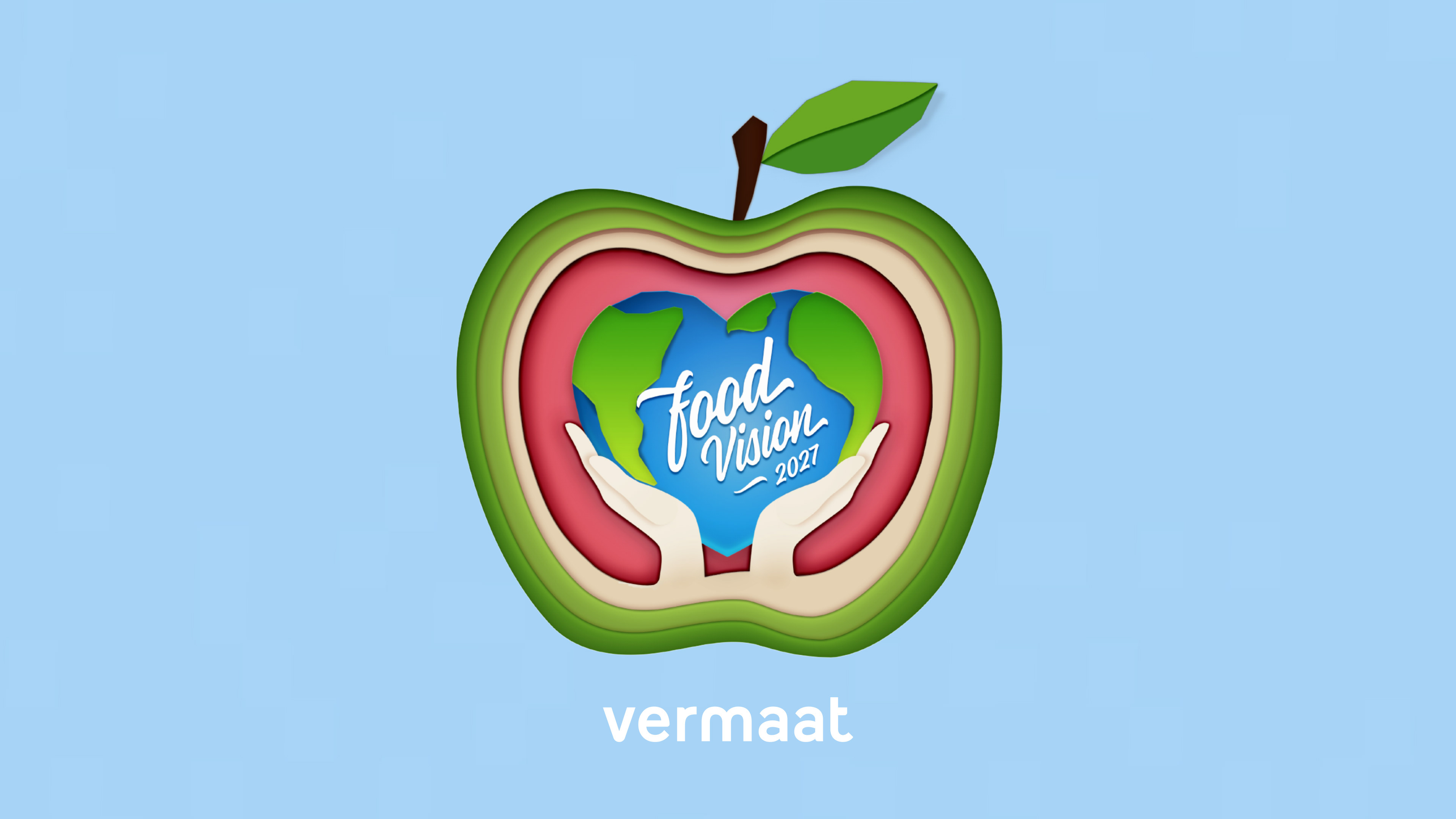
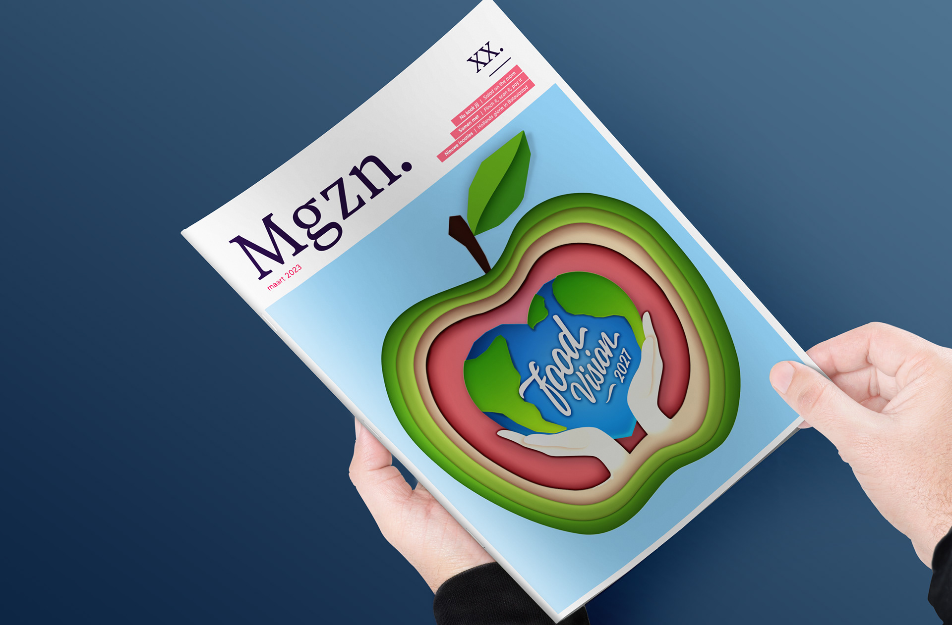
Welcome to my Behance portfolio page showcasing the exciting project I worked on as a designer for Vermaat, a leading Dutch catering company. Together with my colleague Casper Boermans, we had the pleasure of creating the innovative Foodvision 2027 project using a unique paper cut-out style. This project allowed us to explore the intersection of design and food, and to showcase how creativity can be used to communicate and inspire change.
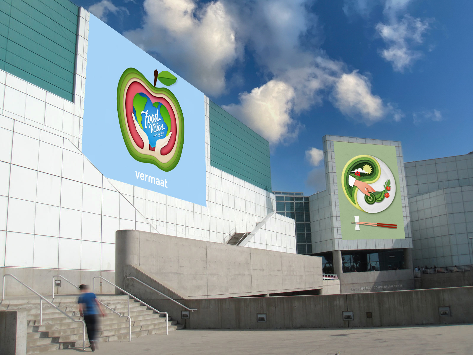
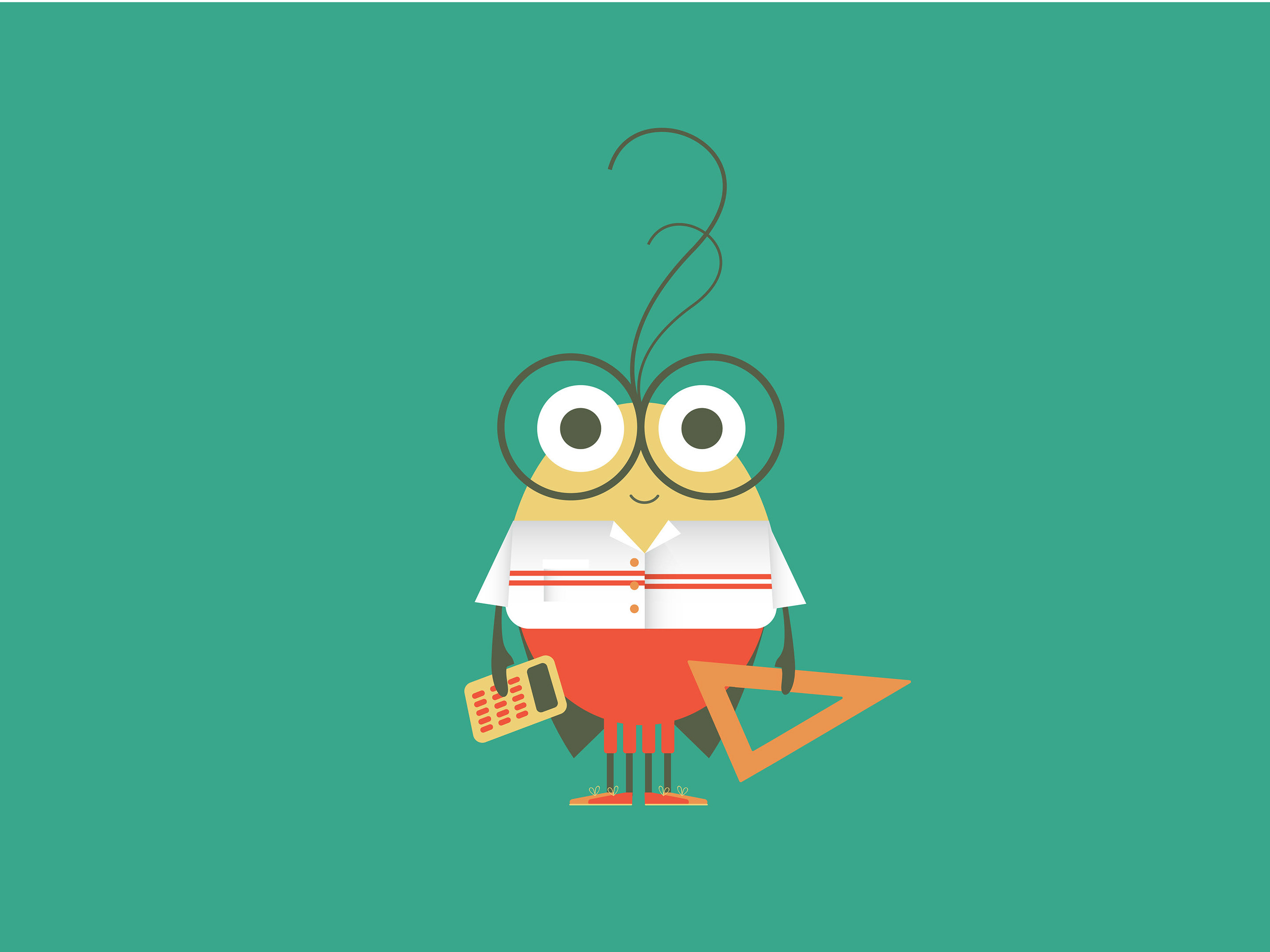
As part of the Foodvision 2027 project for Vermaat, we created a range of design solutions, including magazine illustrations, a one-minute animation, on-screen titles, and a brand guide.
Our goal was to communicate Vermaat's vision for the future of food in a visually compelling way, using our expertise in design to help them stand out in a crowded market. With the magazine illustrations, we were able to showcase Vermaat's innovative approach to food and sustainability, while the one-minute animation provided an engaging and dynamic overview of their vision.
The on-screen titles helped to create a consistent look and feel across all of Vermaat's promotional materials, while the brand guide ensured that their visual identity remained strong and cohesive.
Overall, it was a pleasure to work on such an exciting and forward-thinking project, and I am proud of the design solutions that my team and I were able to create for Vermaat.
I am thrilled to share with you how we helped Vermaat envision a brighter, more sustainable future for food. Please take a moment to browse through my portfolio and discover the unique design solutions we implemented to bring Vermaat's vision to life.
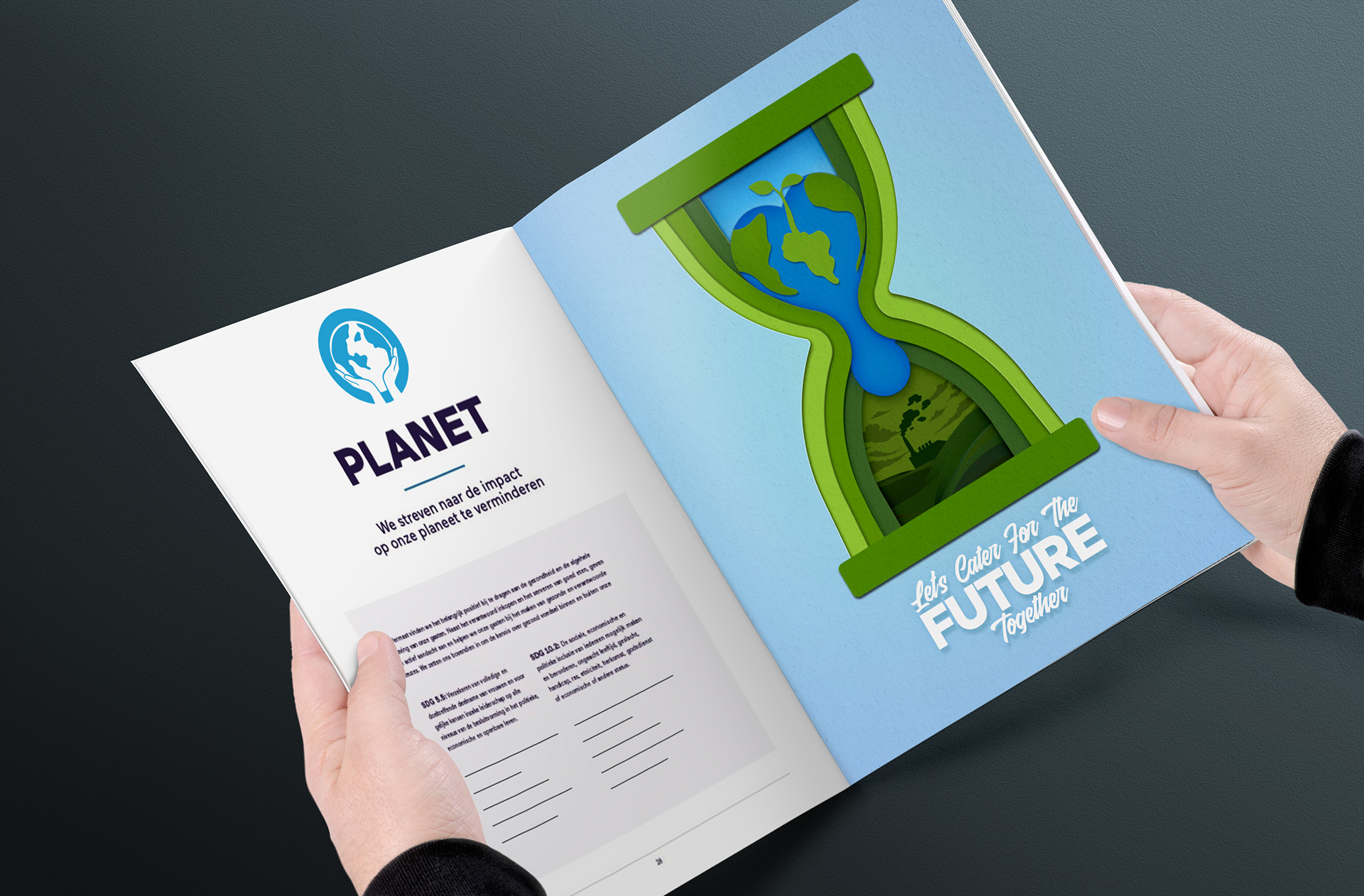
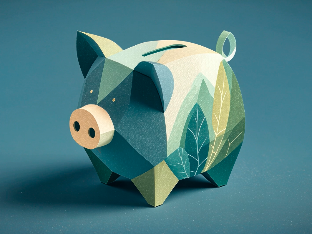
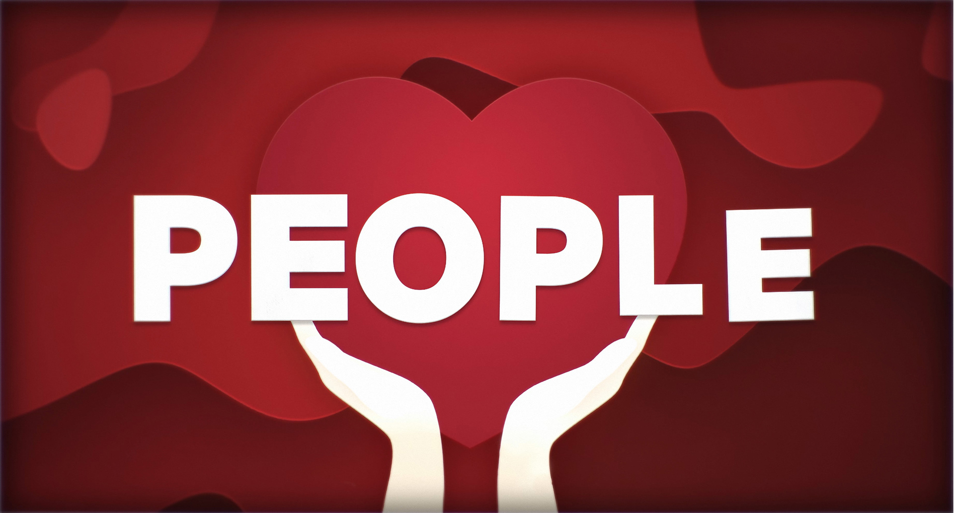
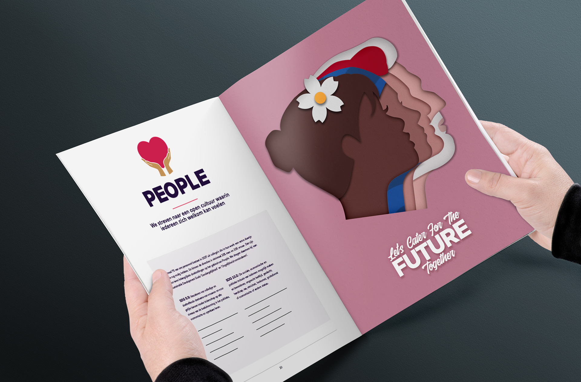
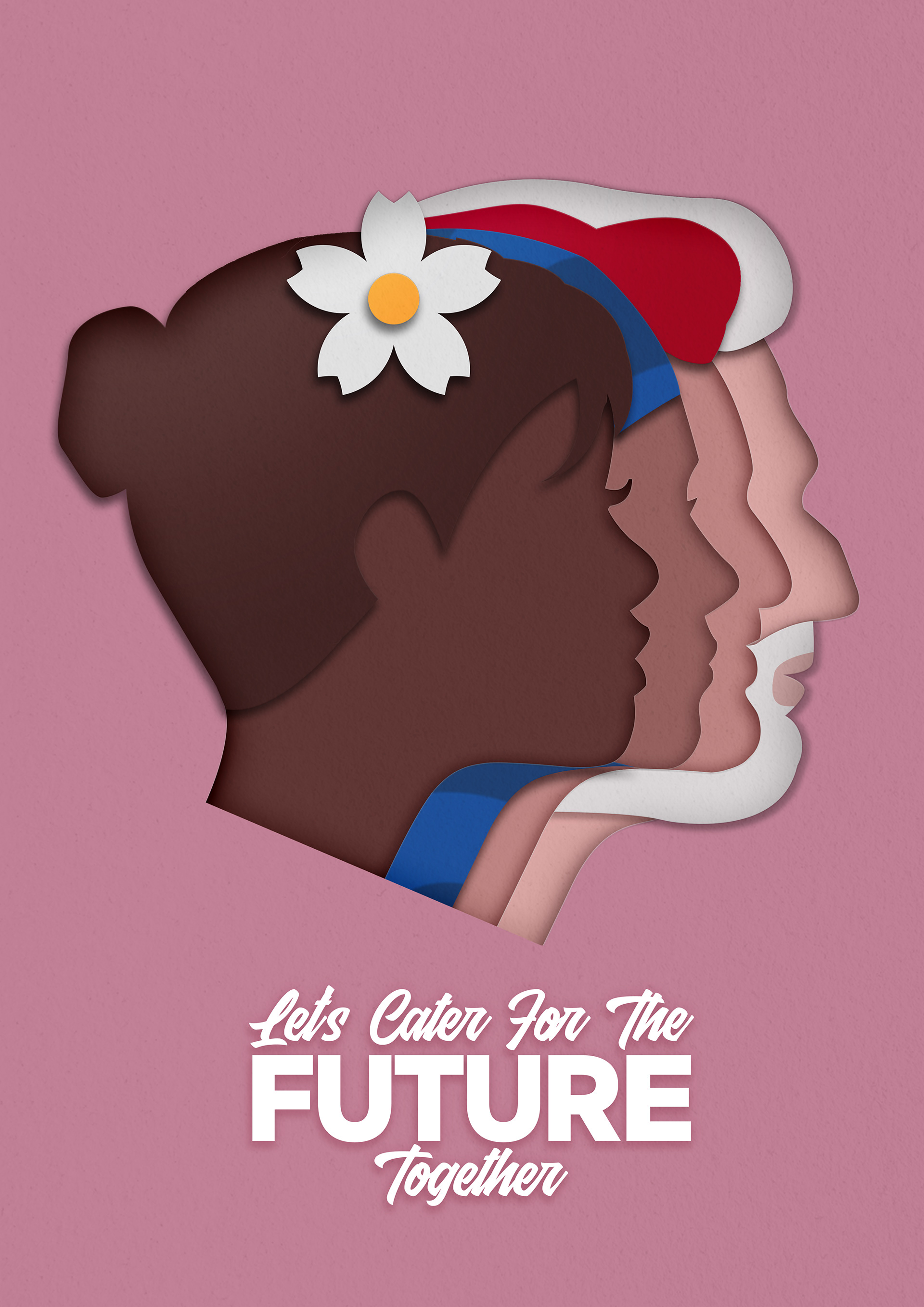
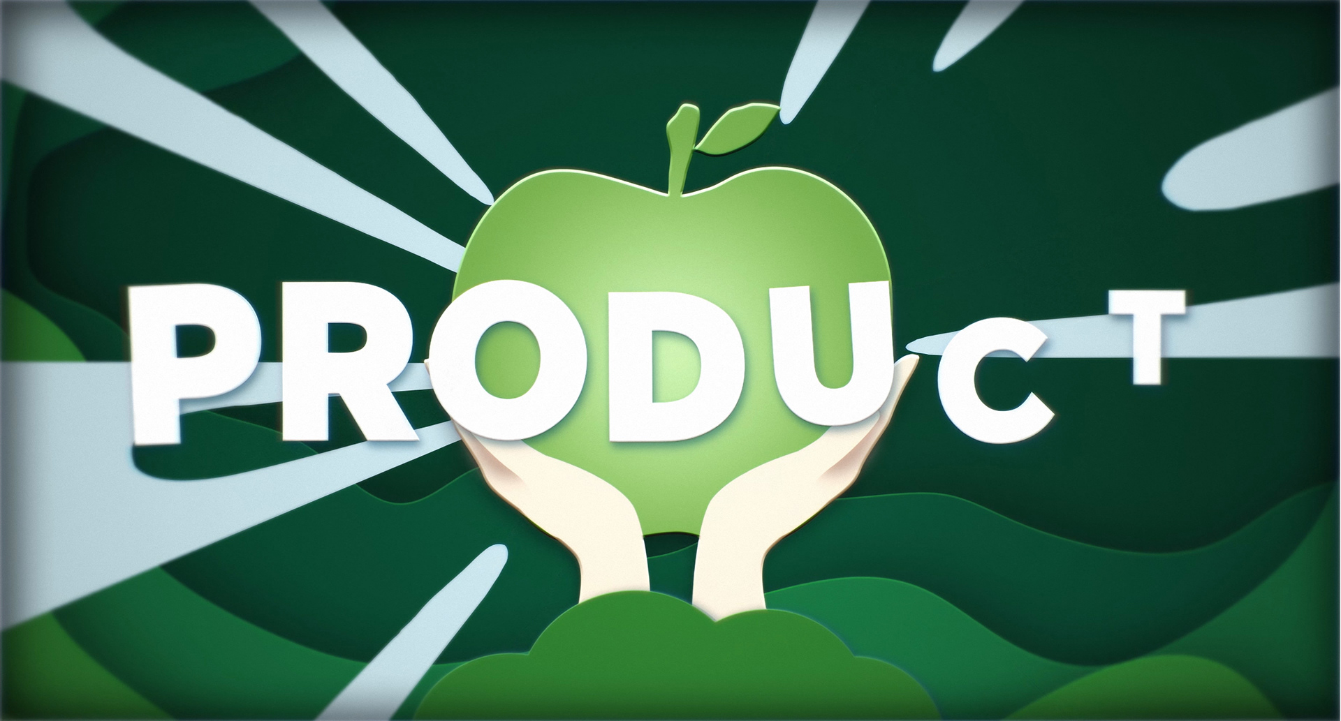
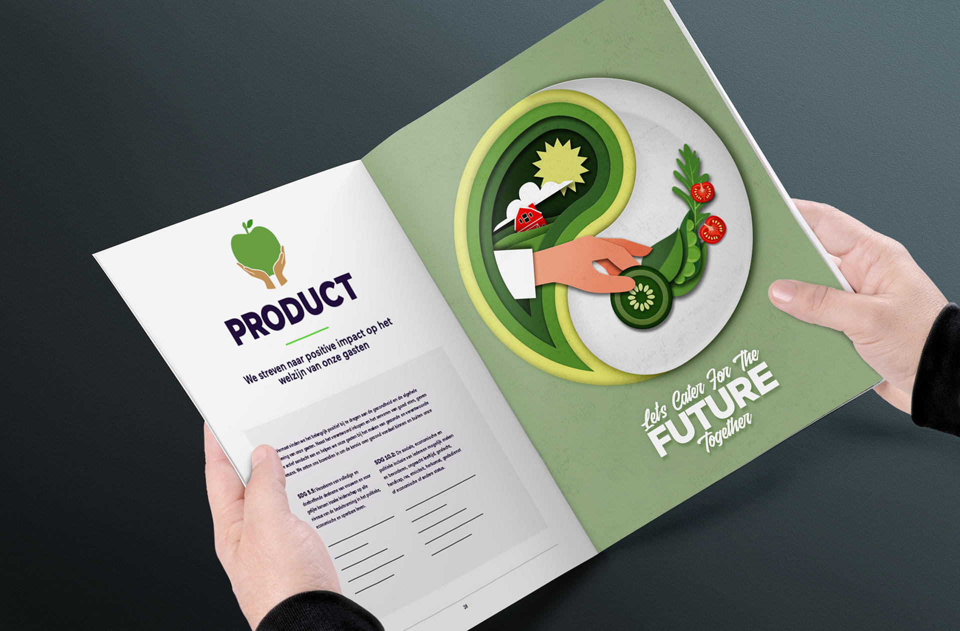
At the heart of the Foodvision 2027 project for Vermaat were three key pillars: People, Product, and Planet. These pillars served as the foundation for our design solutions, as we sought to communicate Vermaat's commitment to creating a sustainable and socially responsible future for food. The People pillar focused on creating a positive impact on society, promoting diversity and inclusion, and providing healthy and sustainable food options for all. The Product pillar emphasized Vermaat's dedication to innovation and quality, striving to create delicious and healthy food while reducing waste and environmental impact. Finally, the Planet pillar highlighted Vermaat's efforts to reduce their carbon footprint and become more environmentally sustainable, as they work towards a future where food is produced and consumed in a way that is healthy for both people and the planet. By aligning our design solutions with these three pillars, we were able to create a cohesive and effective visual identity for Vermaat's Foodvision 2027 project.
For the People illustration in Vermaat's Foodvision 2027 project, we created a striking design using paper cut-out style figures. These four figures represented a diverse range of gender, age, race, and religion, emphasizing Vermaat's commitment to promoting diversity and inclusion. By using paper cut-out style figures, we were able to create a playful and engaging illustration that showcased the importance of community and collaboration in creating a sustainable and socially responsible future for food. Our design aimed to convey the message that everyone, regardless of their background, has a role to play in building a better future for food. Through this design, we were able to highlight Vermaat's commitment to creating a positive impact on society and providing healthy and sustainable food options for all.

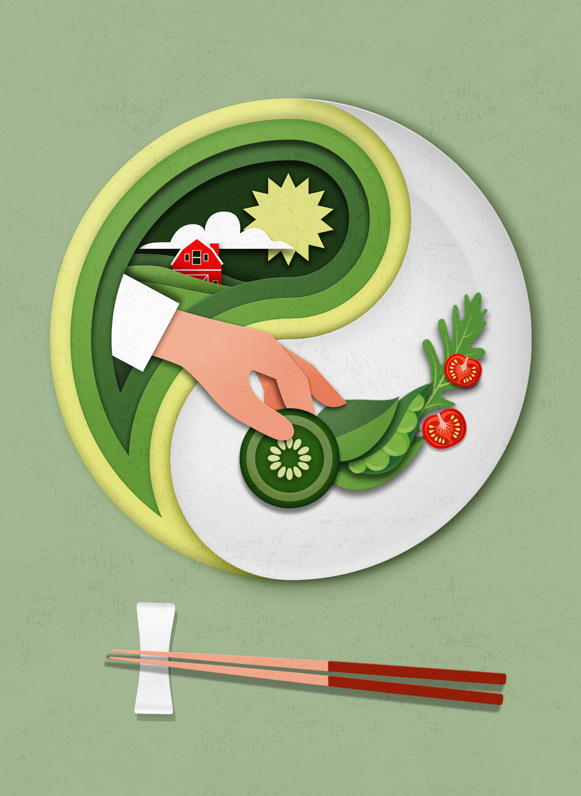
For the product illustrations in Vermaat's Foodvision 2027 project, we drew inspiration from the Yin Yang symbol. We used this iconic symbol as the base for our design, with the left side representing the farm land and the right side representing the food on your plate. This approach allowed us to create a visually striking and meaningful illustration that highlighted Vermaat's commitment to sustainability and innovation. By emphasizing the connection between the farm land and the food we eat, we were able to showcase the importance of responsible and sustainable food production. At the same time, the use of the Yin Yang symbol added a sense of balance and harmony to our design, creating a unique and memorable visual identity for Vermaat's product illustrations.
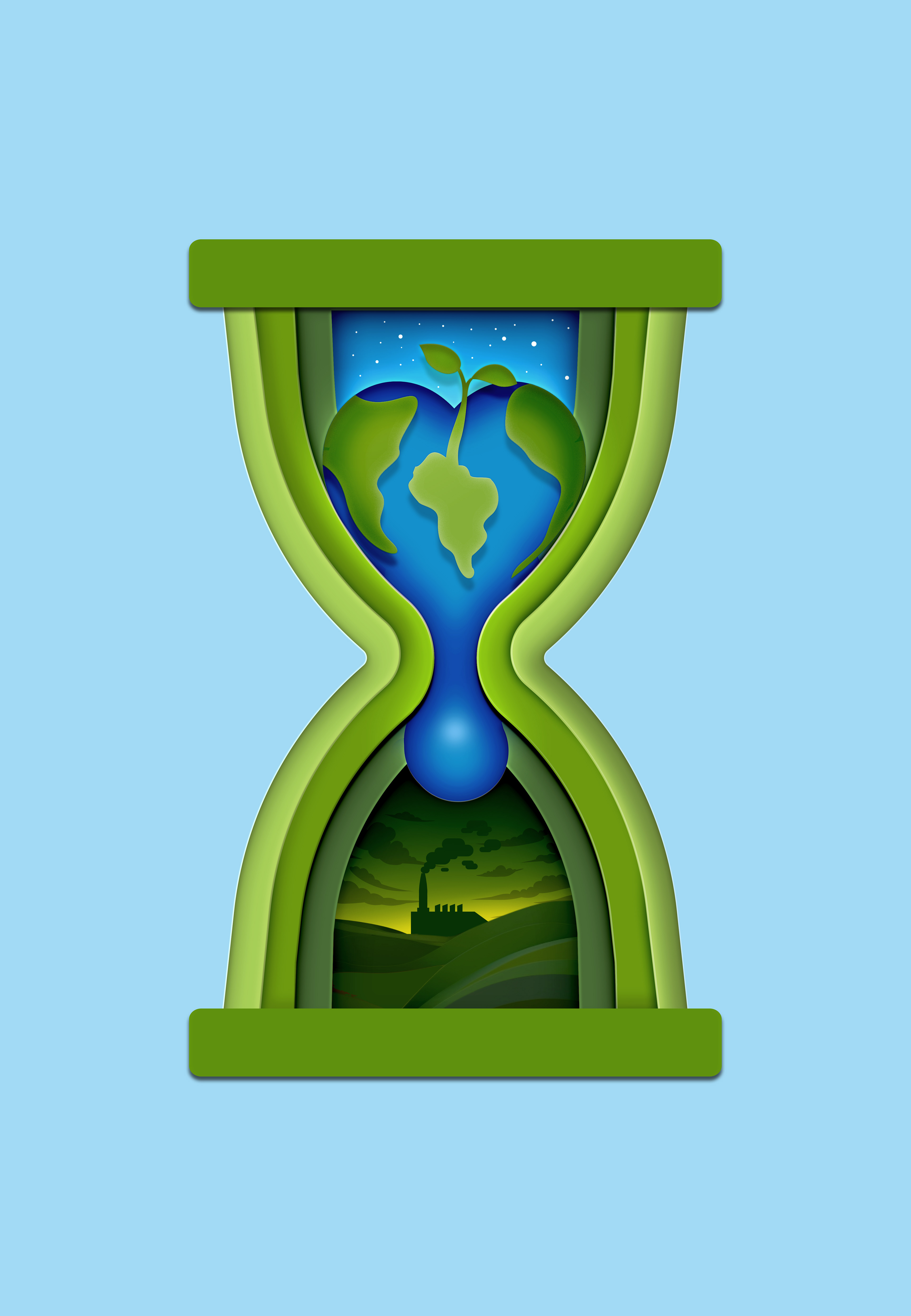
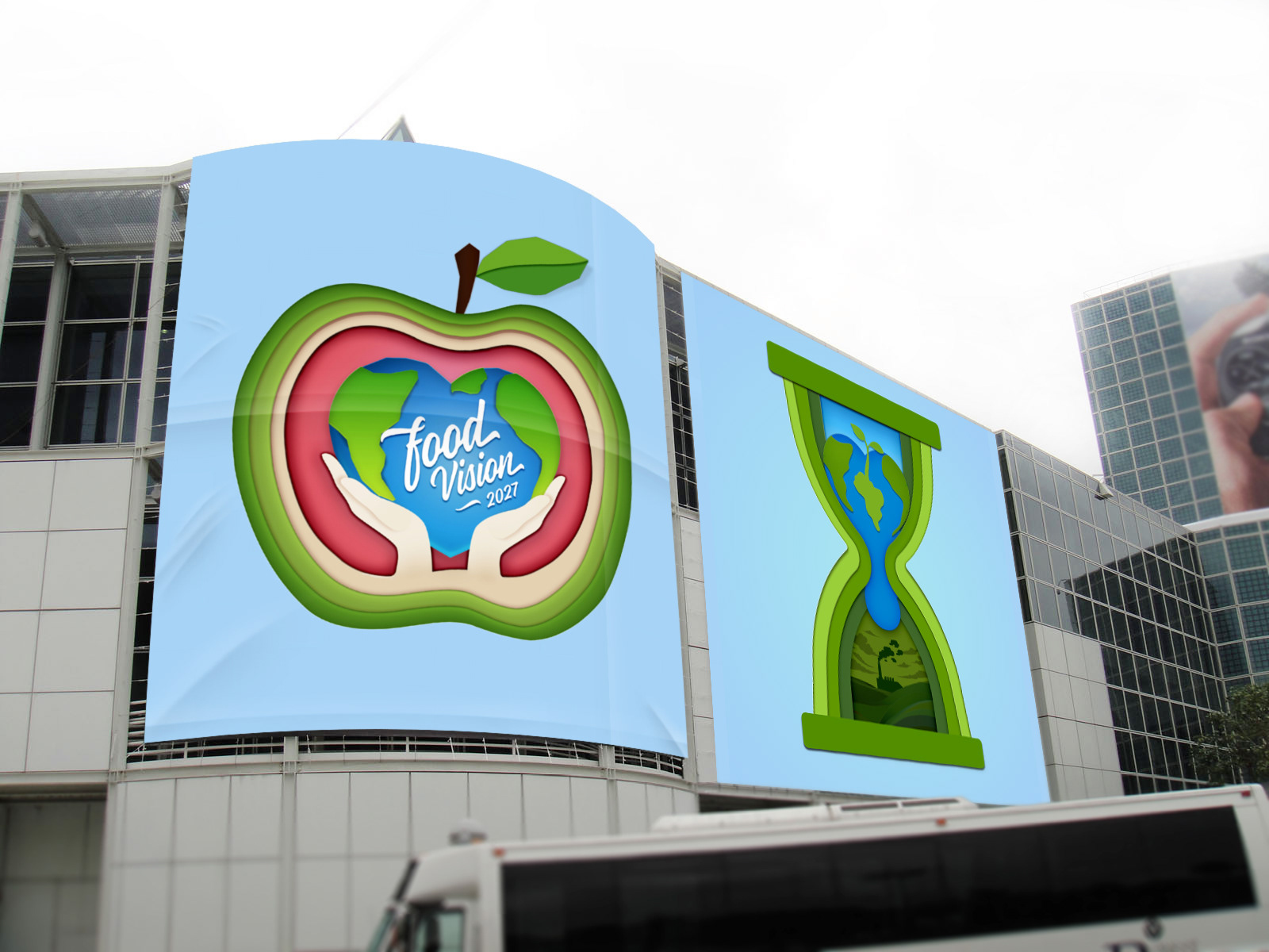
For the planet illustration in Vermaat's Foodvision 2027 project, we drew inspiration from the hourglass symbol. We used this iconic symbol as the base for our design, with the planet illustrated on top, dripping into a polluted world below. This approach allowed us to create a visually impactful and thought-provoking illustration that highlighted Vermaat's commitment to environmental sustainability. By emphasizing the urgency of the environmental crisis and the need for immediate action, we were able to showcase the importance of responsible and sustainable food production. At the same time, the use of the hourglass symbol added a sense of urgency and impermanence to our design, creating a unique and memorable visual identity for Vermaat's planet illustration.